Jun 11, 2021
Fundraising event homepage design tips

You have your next fundraising campaign set and ready to go. How can you make sure your GiveSmart homepage looks superb and offers a fantastic donor experience? Your fundraiser’s homepage is critical to your campaign’s success. It’s the landing page donors will arrive on when they’ve chosen to attend your fundraiser or donate outright. If it’s easy to navigate, visually appealing, and branded to your organization, you may have a higher donation rate and larger gifts overall.
GiveSmart’s customizable event websites make it easy to create a stunning website that matches your organization and features tons of eye-catching interactive content. Learn how to make yours stand out.
Why your homepage is so important for the success of your fundraising event
Your homepage acts as a central hub for your fundraiser. If it’s a virtual event, it will be the first thing your attendees see when they join the event and will frame every aspect of the evening. If it’s an in-person or hybrid fundraiser, guests may encounter the homepage as they’re signing up for the event and as they bid on auction items or donate from their phones.
In any case, the homepage appears at critical points in a donor’s journey. The exact design, layout, and phrasing can communicate essential information and encourage more donations. In 2020, online giving grew by 21%, and the average online gift averaged $117 — which is $29 higher than the year before. It’s clear that donors want to give online now more than ever, and your campaign website is a chance to capture those digital contributions.
5 Tips for designing an experience that welcomes, engages, and encourages donations
At GiveSmart, we’ve been helping nonprofits working for all sorts of causes design impressive, user-friendly event websites. Here are a few tricks we’ve seen have the most success:
1. Emphasize the donation button
Most visitors land on a dedicated fundraising event website with the intent to donate. Make it as easy as possible for them to follow through on that intention with a donation button that’s right in view. Using a unique color that matches your organization’s color scheme or event theme while contrasting from the primary site color will make it pop without detracting from the rest of the page.
You can also give the donation interface more page space by including buttons with suggested donation amounts, such as $25 or $100, with options to select one-time or monthly donations. Bonus pro tip — preselect the monthly giving option to encourage more donors to contribute frequently and help build a predictable income.
2. Make it mobile-friendly
At a hybrid or live event fundraiser, your guests will visit the event page using their mobile devices to access the mobile bidding and text-to-give features. Even virtually, many donors may discover the link to your site via social media or after browsing their emails on their phones. According to a 2020 report, 60% of nonprofits’ campaign traffic is on mobile devices, and 30% comes from social media.
While you’ll likely design the site on a computer, make sure every aspect of it looks good and is easy to navigate with a smartphone. Make sure the site includes:
- Mobile responsive design: Responsive design ensures a site looks good on any sized screen. Buttons, text, and images will automatically resize themselves to fit the screen’s height and width.
- Large buttons and text: These features make your site accessible to people with vision loss and make things easier to read and click on via mobile devices.
- Straightforward donation forms: Make sure your donation forms are simple with as few fields as possible. This can ensure more of your donors fill out the form completely without having to type too much with their thumbs.
3. Incorporate rich content
High-resolution photos can tell a story about how a donor’s generous contribution will drive an impact. Videos help frame and introduce your event or your organization as a whole. As fundraiser events lean more heavily on virtual and hybrid components than they have in the past, multimedia web content takes center stage. It’s what makes your website feel like an event rather than a fancy donation collection form.
GiveSmart’s event website builder lets you easily incorporate rich text and video while allowing for enhanced image placement through responsive, mobile-friendly design.
4. Practice minimalism
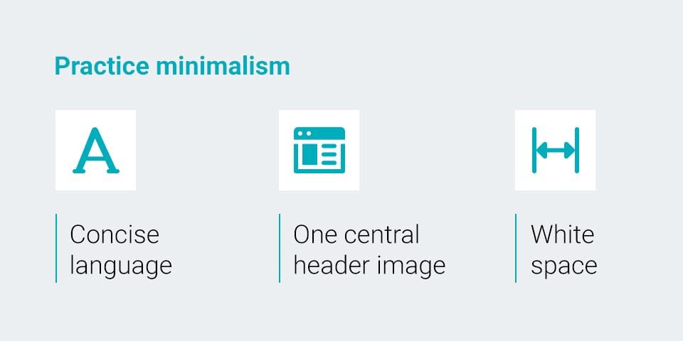
The best web design is simple. By cutting out as much visual noise as possible, you make your homepage effortless to navigate and much more pleasing to the eye. Here are some features of a beautifully minimalist homepage:
- Concise language: Considering how quickly you have to capture a web visitor’s attention, every heading, sentence, and phrase must tug at the heartstrings and resonate with readers. Pairing down phrase-heavy language and punching up your verbs and nouns will make your appeal more concise and impactful.
- One central header image: The top third or so of the page is prime real estate for a captivating image. Many nonprofits include a graphic with the name of the fundraiser and the date and time. Include a powerful image and only the most essential information in the banner.
- White space: Depending on your plans for the evening or week of the event, you may have several blocks of information on your homepage. You may have a button to buy raffle tickets, a program schedule, videos, and a sponsor section. These elements can all live in harmony as long as you include lots of white space. Blank space along the margins and between graphics and text gives the eye a break and frames important information.
5. Decide how to highlight your sponsors
One of the reasons a fundraiser website is so valuable is because sponsors love to place their logos online. It’s a better advertising opportunity than on a physical paper program because donors will spend more time browsing through your site during a virtual or hybrid event.
Your organization can secure more sponsors or earn more donations from your corporate partners by considering how you will feature their logos. Some groups let sponsors place a custom message next to their logos. Others will reward their highest-tier sponsors with larger graphics or a more prestigious title. It’s essential to keep your guests and donors in mind. Thank your sponsors elegantly without letting their content distract from the main event.
Examples of great homepages for online fundraising
Check out these fantastic examples of visually appealing fundraiser websites that make for successful campaigns:
Wyoming Symphony Orchestra — Wine and Dine In
The Wyoming Symphony Orchestra had an elegant virtual event idea with their Wine and Dine In event. Their event homepage was just as refined. They picked a deep red to fill the background, a simple header image and an event logo that perfectly matched their event theme. The “Donate Now” button features the same cabernet hue and stands out as the first element below the page banner. They incorporated versions of the event logo throughout the page, including their event partners and sponsors feature.
This simple and attractive page design helped this organization meet its fundraising goal of $30,000.
NAMI Waukesha — Blue Jean Bingo
NAMI of Southeast Wisconsin made their virtual bingo event come alive with an eye-catching event website complete with consistent event graphics throughout the page. Above their donation button, they included a yellow and blue graphic that matched their logo’s color scheme displaying, “Every $1 of your donations matched!” which helped encourage more donations throughout the event. They also created similar visuals featuring yellow, blue, and lime green to highlight the event timeline and give all the silent auction items an attractive, consistent look and feel.
NAMI Waukesha’s event website is a master class in branding uniformity and visual appeal alike.
Special Olympics New York — Summer Social
Special Olympics New York made their virtual event website pop with a large-format image of their last in-person event as a background graphic and another image as their header. The top of the page included many ways to donate, including buying tickets for the event, viewing bid and “buy now” items, and participating in the auction without attending the event. Below that, they featured a donation button with suggested amounts.
The rest of the page featured custom event graphics, including directions for a DIY cocktail, a themed invitation, and an attractive event sponsor graphic in the organization’s signature orange.
Build your virtual event hub with GiveSmart
GiveSmart makes building your virtual event website simple with customizable features and all the fundraising tools you need to capture donations. From mobile bidding to raffle prizes in an attractive, intuitive website interface, you have the power to meet your fundraising goals. To see all you can do with your event website using GiveSmart, set up a free demo today.

Related

Boost Your Fundraising Through Luxury Travel Packages
Who doesn’t want an excuse to get away from it all? If you’re looking for…

8 Simple Ways for Fundraisers to Stay Positive
In tough economic times, fundraising rejections can be more common and might get your team…

How to Calculate Net Gain from Your Nonprofit Event
With in-person events as a cornerstone fundraiser for many nonprofits, nonprofits are always looking for…
